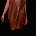
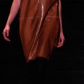
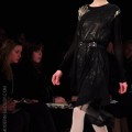
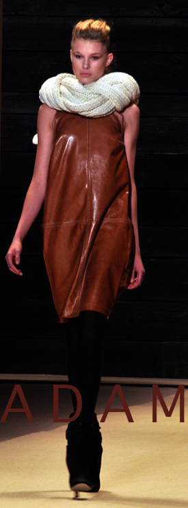
 Architectural pleats and layers dominated Adam Lippes’ namesake label this season. Bold berry hues and rich burnt orange played right into the F/W season with neutral cool greys, black and charcoal. Exposed metal zippers and dark sequin effects added a clean line of rigidity to the feminine shapes in luxurious fabrics, leathers, and fur. The warmth of the collection waxed and waned as neutrals floated in between burst of traditional fall hues. Metal appliques gave a protective coat of armor and deliberate, sharp tailoring hinted at a fitted form. The use of clearly girlish touches in crinkle pleated skirts mixed deliciously with cozy thick cable knits coated in foil. The few but purposeful and beautiful prints in the collection shone from the subdued first plaids to the last abstract animals. ADAM’s Fall/Winter collection simply just gets better the more you look at it. — Rachel Rozzi
Photos by Stevyn Llewellyn
Tag Archives: new york
Academy of Art University Fall 2010
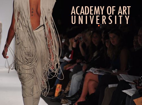
Six of the best and brightest students at the Academy of Art University debuted their collection at the tents at Bryant Park on Saturday, February 13th. The collections are representative of 4 of the school’s programs: Fashion, Knitwear, Technical and Textile Design. I always look forward to this show, if only to take a peek at what young designers are thinking about, if they’re questioning or reacting to the current climate of Fashion or if their approach is more interior. More often than not, their ideas are always conceptually rich, drawing from models of nature, or the history of photography or painting or architecture. Sometimes, it is the personal telling of someone’s memory or past. It is always exciting to see how they will translate it into clothing, and being that Fall is always big on knits, I was ready for some textural surprises. Knits in beautifully geometric shapes sprouted cone-like off of shoulders in Steven Oo’s merino wool collection, inspired by the Architecture of Massimiliano Fuksas. Hyo Sun An created spaghetti like strings hanging riotously off of shoulders on strong silhouettes which quite easily felt sci-fi and kind of streetwise/rock and roll. The romantic, prairie like creations of Naomi Sutton was my own personal favorite. It felt both dark and naieve, almost Amish, with long white cotton dresses that resembled undergarments taking on an American goth feel. Sabah Mansoor nestled jewel shaped crystals in her crocheted knits which had an interesting stars in the night sky effect. She also employed a Japanese technique of dying which consisted of creating a pattern by binding, stitching, folding and twisting fabric. Marina Solomatnikova’s collection was elegant, feminine and had a strong art-deco feel, with high silk blouses peeking out of structured sueded jackets. Bethany Meuleners truly employed the layering technique in her deep plunging gowns, mixing sheer chiffon over wool and lace and letting them as she states,”land off kilter.” A promising show for 6 young designers to watch.
—Jeanie Kwak
Photos by Stevyn Llewellyn
Act • 1 Design Presentation Fall 2010
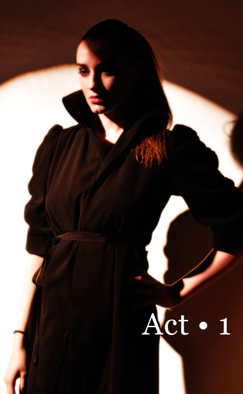 Wednesday night, I made my way into Chelsea to interview designer Sally Wu and her debut line Act 1. I was a bit late since I took the F train and had to physically run across town from 6th Ave to 10th and 11th. Those are long city blocks. And in heels, no less! I finally saw the familiar Highline (dark and sleepy due to winter days) and went through the glass doors to a quiet gallery. Immediately, I was hit by walls of bodies, girls in short chiffon dresses and dark eyeliner, men in bowties and glasses. I found my photographer and he pulled me backstage. Ok, we have 5 minutes. Models peered at me from behind another room, already dressed, their clothes rustling a bit, their hair sleek in the front and teased to a nebulous ponytail in the back. Sally stood still amidst the chaos, smiling and calm. We did our interview. Her collection, which was constructed in a record two weeks (my mouth dropped open at this and then seeing her collection, I was even more amazed) has the kind of sexy, effortless appeal that nyc girls aspire to. A cream colored ruffle silk blouse was a favorite, also the knit jackets with knotted bits of tulle and the wonderous wool boucle jacket with long nubs that fell down the front. I was especially taken by her knitted wool scarves in winter white colors that fit snugly around the necks of models. Her architectural influences are evident in her cocktail dresses, streamlined, but not severe and completely wearable. The mood was serene, the crowd watchful and silent. Whispers began to flutter around: ohh, wow, that’s great, do you like that? yes, that’s sensational. I turned around and it was a beautiful elderly woman with the brightest brown eyes and her husband in a smart red sweater and bow tie. I smiled. A litle asian girl stared at a model, her mouth open, her eyes wondering. Flashbulbs went off. And then I realized that simplicity and elegance is translatable at any age, in any language. — Jeanie Kwak
Photos by Stevyn Llewellyn
Visit Act • 1 online here
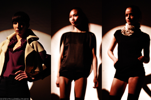
Watch the video interview below:
Video by Stevyn Llewellyn
BCBG Max Azria Fall 2010
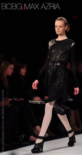 For Fall/Winter 2010, BCBGMAXAZRIA presented a sophisticated and feminine collection. Neutral tones were the dominating color in this season’s palette. Colorblocked with vibrant touches of yellow and blue, together with classic shades of black, grey and navy, they created clean geometric silhouettes. Leather piping and trimming details added to the geometric aesthetic. Prints were simple and graphic inspired in muted colors. Embellishments were also minimal. Some sequins and studs appeared to be painted on in brush strokes onto cropped tops and dresses. The main theme was the asymmetrical draping of flowing silk dresses and tops which were then layered and/or belted in almost every look. This collection is for a modern urban woman with a refined yet effortless style.
—Maria Giannakakis
Photos by Stevyn Llewellyn
Lilith
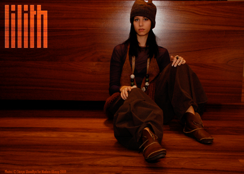
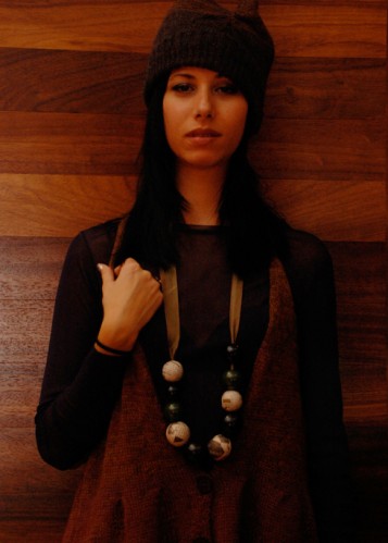
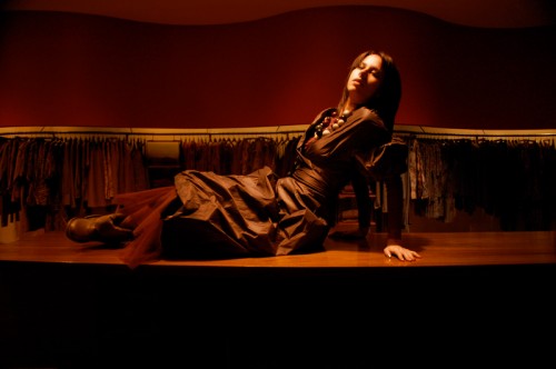
Along a darling row of shops on Mulberry sits Lilith, a beautifully ambianced storefront and space with dark wood accents and a ripple of cranberry wall. The boutique is a veritable treasure trove of unique hand crafted pieces meant for layering while also being statement pieces on all their own. From jewelry, knit vests, mesh basics, leather shoes and much more, the assortment shows a true dedication to the French design team’s vision. Lilly Barreth, head designer, is inspired mainly by Rei Kawakubo’s Comme des Garçons (along with other asian designers of the 70’s and 80’s) and designs for the multi-faceted woman.
- Lilith is derived from Lily Barreth’s first and last name
- The name Lilith is also known in Jewish Folklore as Adam’s first wife before Eve, who created equal to him, ran away after seeking equality in their relationship
- The boutique is 2350 sq. feet of shopping bliss and opened Sept. 30th, 2002


