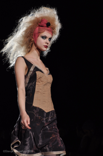
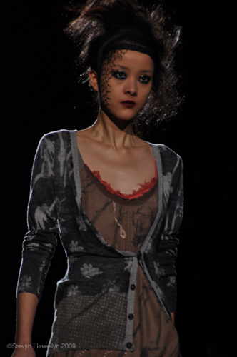
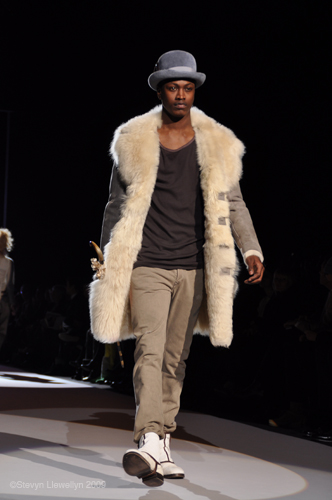
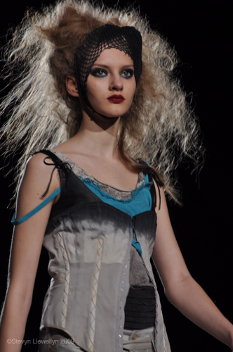
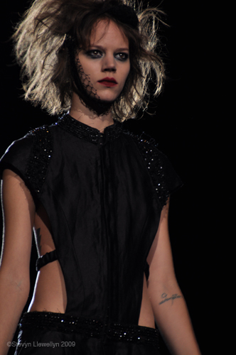
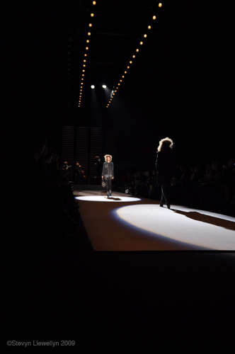
 The Academy of Art University showcased seven of their newly graduated designers from the Fashion, Textile and Knitwear Design program on September 12th at The Tent (Bryant Park). That’s no small feat for a young designer- a show at the Tent is sure to garner some attention. The show was an eclectic mix of lively colors, interesting play of shapes, cuts and textures, each designer veering off from their own source of inspiration—whether it was a David Hockney Painting, a Thai Buddhist temple or the intricate architecture found within a gem, each had a unique expression and vision.
 Marina Nikolaeva Popska, a designer born and raised in Bulgaria, drew on the “color and chaos” of nature. Her collection was full of multi-colored jacquard dresses. The weight of the knits actually swayed a bit as the models walked down the runway. I thought this was interesting—I enjoyed watching the movement of the garment—one could feel and sense the pendulous weight of it. The patterns were lovely, rich but also carefully muted by a background base of nude tones. One particular dress reminded me of the inside of an oyster. Lovely.
Kara Sennet, drew upon the David Hockney 1966 painting, Beverly Hills Housewife.
The colors felt candy-like, sweet, almost artificially sweet, and I have to wonder if this artifice was intended, and I have to say yes, despite the retro-looking cuts and boat neck tunics. Once I saw the super shiny turquoise vinyl pants and wild neon yellow platforms, I see that she was taking the artifice and having a bit of fun with it. The color blocked bows are sweetly wrapped around the waist but are not actual bows. Models wore white rimmed shades and looked like larger than life dolls.
Amanda Cleary has interned with Elie Tahari and Verrieres and Sakko. Her background is in graphic design which accounts for the strong collage like feel of her collection. Her concept is “packaging design.” There are interesting cut-out details, almost puzzle-like and cut out key hole peeks of the neck and arms. Patterns are placed with different textural feels, such as bonding black silk Lurex to cotton twill which results in the look of eel skin. An interesting, strong collection.

Richelle Valenzuela, born in the Phillipines and long time San Francisco resident used the facets of a gem as inspiration. He focused on the architectural structure of a gem, its chambers, rather than its glitz. Working in gunmetal greys and slate blue silk organza, his collection swayed in layers of accordian like fabric and neatly pleated tops and skirts. White button down shirts were worn underneath his grey swaying pieces, providing a crisp, austere background to his architectural pieces. This only further accentuated the rich sway of fabric. A lovely collection.
Brittany Major, a designer that hails from the Carolinas, and who once interned with Zac Posen, had a collection full of bright plaids. While plaids may make one think of preppy conservatism, her collection deconstructs the idea of “preppy” and plays with one’s expectations where this pattern is concerned. Playful and fun.
Jie Pan, a designer from China, used the abstract paintings of Anna Fidler to show her technical design skills. There are strong geometrical cuts here, and strong contrasts of material such as horsehair with silk chiffon, linen with organza. Peak shoulders were wonderful to see. A strong, confident collection.
 Sawanya Jomthepmala was born in Thailand. She drew upon the glass mosaics of Thai Buddhist temples as well as origami-like details of Krathong which are small boats made out of banana leaves. Her collection was full of neon prints and playful, symmetrical prints. Vests had wonderfully arched lapels, which unified a bright, energetic collection.
– Jeanie Kwak
Photos by Rachel Rozzi and Stevyn Llewellyn
[svgallery name=”academy_of_art”]


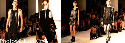
 You know– the hems have little silver chains hanging off of them, said the photographer, who had gone backstage to take some photos. Oh, that’s delicious, I said. We were milling about the halls of Milk Studios in Chelsea and we had just witnessed Rad Hourani’s Spring 2010 line. After a week full of light ruffles & floaty gowns in pastel colors and coral hues, the dark, minimalist vision that greeted us down the white-washed runway was a welcome change. Here was the stripped down, sleek aggressiveness that I equate with fashion militia—you know those kids- they club, they ride the subways, they cluster in dark little herds and host late night fetes in hotel rooms.
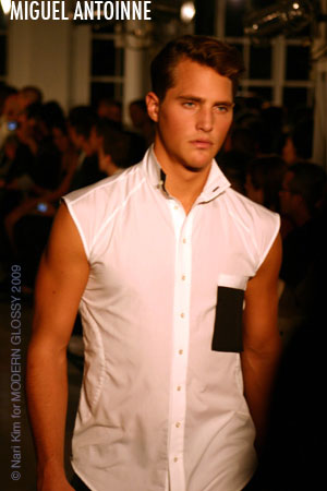 I really like the idea of a man who can breeze into, say, the Plaza hotel with a crisp black blazer, aviators, cropped trousers and a loose tank. This man would look tailored, classic but still modern. And what do we mean when we say modern? Modern as in relevant, a reflection of the times, while still remaining classic. Miguel Antoinne premiered his Spring/Summer 2010 collection at Studio 450, a gorgeous white washed loft, the perfect setting for the show we were about to witness. His inspiration was the sudden beauty one experiences in a thunderstorm, the calm before lightning strikes, the tension and stillness. You can see it in his crisp shirts, you can see how the stormy colors make its way into his pebble washed cotton tanks and woven shirts. Zig-Zag patterns could be found on suits, dark patterns repeating on white linen. The tailoring is sharp and the silhouette is clean, while the shirts seems softer to provide relief. Tailored shorts were high-waisted and dare I say it? Sassy. It’s a wonderful, fresh look. Trousers were smartly cropped (the hem can be manipulated to be shorter or longer) and were worn with shiny patent leather brogues. Tuxedo blazers were reinvented with inset lapels, which were a nice touch. A wonderful, invigorating collection.
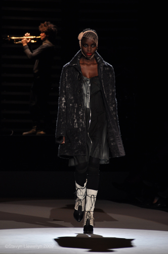
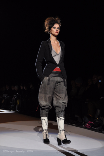
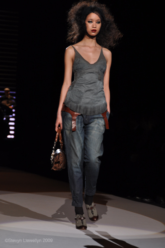
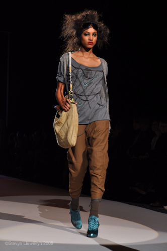
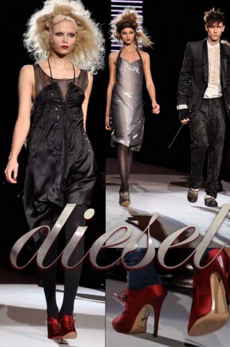 Is the recession making us all a bit more maudlin and nostalgic? Not that that is a bad thing; looking back is always a good way to reference a feeling one might find relevant now. And looking at Diesel’s Fall 2009 line made me recall just that: my days in Seattle, however post grunge, still lingering in my visual memory: Messy cardigans, torn deconstructed tshirts, combat boots and the I-don’t-care-if-sequins-clash-with-floral attitude is here, but refined.