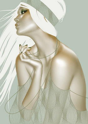
 The first time I saw Autumn’s work was while looking through a Neiman Marcus catalog, and I was enamored by the carefully rendered female figures depicted wearing various garments on a neutral ground. Autumn’s work, upon first glance, commands the viewer’s attention. The strength of her work is evident in the technical ability, strong compositional elements, and primarily distinctive lines.
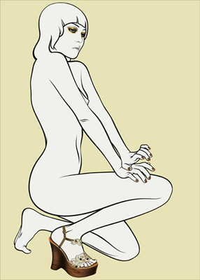
Whitehurst’s illustrations encompasses the simplicity of this line with an almost ethereal aspect, which evokes an underlying spiritual quality. Her artwork depicts individuals in minimalistic environments which add emphasis to the figure as a linear element to the composition. Giving attention to certain aspects present the viewer with a fresh visual image. The removal of some elements gives importance to the ones the artist intends you to look on.
Working on art is a continuous thought process involving constant decision making. It can be said that to make something look effortless, a lot of work has to go into it.
Evocative of traditional Art Nouveau, and hints of the stylized quality of Alberto Vargas, yet entirely contemporary through the use of modern materials, Whitehurst’s work is something to behold. I was delighted to be able to contact Autumn and interview her regarding her work.
 How would you describe your aesthetic?
I think I would describe my aesthetic as a concentrated area of texture in a field of color, and that description of course leaves a lot open but for me that’s a good thing(!), to not tightly define what I’m most fond of. It leaves me room to play without making me feel as though I’ve strayed too far from my intentions. Most of the commissions that I get are beauty oriented though this past year I’ve been doing more celebrity portraits, which was unusual but refreshing. Most every job is a collaboration with the art director and I’m not normally inclined to collaborate but it seems to be really good for me. As a result I’ve been able to think more acutely about what stimulates my imagination, and what sucks the oxygen out of it.
What initially inspired you to be an artist?
I’ve always liked making things, and my parents are both fairly eccentric people. When I was very young, I hadn’t realized how unusual they were, they were really just my parents. As I grew older though I understood that the way we saw things was what married me to the friends that I had, the thing we shared in common being that we percieved things a bit differently, and it wasn’t a contrived effort but something that gave us pleasure, we could all get excited in the same direction but in different ways. It can’t be all perception though, and then no output…I’m very fond of images, and so that’s what I invest my efforts in. I’m only trying to make something that I think is beautiful.
Do your surroundings in Brooklyn influence your work?
Brooklyn doesn’t directly influence my work, it does however shape my lifestyle. I love living here because of its cultural diversity and if I need to get out and see something different, I don’t have to travel very far. So though I don’t incorporate its influences into my illustrations, I do feed off of of it.
What art movements in history have inspired your illustrations?
Art movements that I’ve fallen in love with…art nouveau, art deco, surrealism…I’m not as crazy about them now as I had been but I’m sure that the influences have some how woven their way into the illustrations. I was so deeply in love with those periods while I was in junior high, high school, and at that age my skin was so thin and everything sunk to the bone that the impression that was made upon me has left some sort of permanent residue, I’m certain of it.
How does fashion design influence your work?
I look through the collections during the spring and fall shows, and try my best to keep myself informed as to how fashion evolves from season to season. Strong silhouettes and graphics are easiest to work into an illustration but most of my clients have requested the more classic elements of design which have little to do with trends. For example, the waistline has disappeared over the past few years, and my favorite silhouettes are actually quite top heavy, but this doesn’t lend itself to the kind of work I’m usually commissioned for, so I keep a closer eye on textures.
Who are some of your clients in the fashion industry you have done illustration for?
I’ve done quite a lot of editorial fashion work…Vogue Italia, Elle UK and US, Nylon ,ST Fashion (for whom I just finished a portrait of Angela Missoni), and Style.com.
Your work seems to evoke an ethereal, even spiritual aspect to it—Does spirituality influence any of your imagery?
I don’t think it’s really spirituality so much as it is a sense of quiet, which I like not only in my work but in my daily life.
 What was one of your favorite projects to work on?
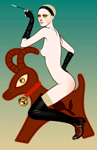
A couple of years ago I was commissioned by the Telegraph (in London) to create a five page accessory spread. They sent me jpegs of what needed to be incorporated into the illustrations and then gave me absolute freedom. My idea was to put the accessories on a set of naked women in a way where it would seem that they had raided the closet and though were having fun, they were also caught up in the fantasy of themselves. One of the images turned out to be particularly silly…a blond dominatrix riding a giant leather reindeer keychain…she looks so serious but the image makes me laugh.
To arrive at the point of having your own unique style, did you feel you had a break though as an artist or was it a gradual refinement of your ideas?
It’s still a gradual refinement of my ideas, and probably always will be. About a year after I began I became incredibly busy, working 16 hour days 7 days a week, and the style evolved itself. I wasn’t consciously grooming my methods, but was responding to the commissions and trying to meet deadlines. A lot of how I work is the result of creative problem solving, how best to make a portion of the image work best within the parameters I’d been given.
The media of artists have traditionally been paintings, and sculpture…How do you see the computer as a tool for a contemporary artist such as yourself, and how does this aid you in creating your images?
I studied painting in school, and really miss wet paint but working digitally has been the perfect medium for me as an illustrator. Initially I was engaged by the challenges of using the software but I’ve continued to use it because it’s extremely practical. I can turn around the work, revise it easily if necessary, and then send it right out. I’ve been working on the computer for nearly a decade though, and it’s changed the muscle memory in my hand. I’m less dexterous as a draftsman than I used to be. The method in realizing an image digitally is very different.
Aside from your commercial endeavors, do you work on your own personal projects?
I haven’t worked on anything that is entirely my own in years. If I have time to spare I need to use it to evolve my commercial style because this is difficult to do while I’m working on commissions, it can throw the client off. While I’m working I have ideas that I want to try, so I make note of it and then hope to flesh it out when I have the opportunity to work with total abandon. Presently though, I have more ideas than time!
 A distinctive quality of your work is the removal of some elements and giving more attention to others, while achieving a truly beautiful result, how do you know when a work of art is complete?
The only way that I know an image has been completed is by recognizing that it’s balanced. I’ll tweak the palette or try to add things, but it’s just not working…which means it’s time to stop.
What kind of art materials do you carry around with you?
I’m embarrased to admit that I don’t carry around anything other than my camera, really, and a small plastic envelope in which I keep paint chip samples. I love color, and walking around in the daylight of the city I see paint wearing off of buildings so I’ll steal a little piece. It’s awful, I know, but I haven’t been caught yet.
What is the most interesting object you own?
That’s a tough question! I’m a chronic pack rat, and my apartment is a museum of collected objects, many of which have been given to me by my dad from his travels as a tug boat captain. I have a lot of bones, bugs, nests, snake skins, old combs, textiles and all sorts of other relics. But last year my uncle gave me a Stereomaster microscope, which I’m crazy about. I like to bring things in from the garden for close examination, but have also scrutinized minute objects from my living space. Absolutely everything is amazing when seen so intimately.
-Interview by Stevyn Llewellyn
Please see the gallery below of Autumn’s brilliant work. Additionally, you can view her online portfolios here:
http://www.art-dept.com/illustration/whitehurst/
[nggallery id=1]
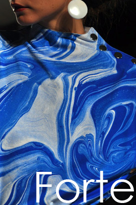

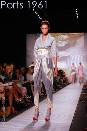 Last season Tia Cibani went to India for her inspiration; this season the Oriental countries of the east influenced her. Beautiful draped dresses, satin kimonos, and printed coats comprised her spring collection. Cibani created innovative silhouettes with her origami-esque pleating and asymmetrical construction.
 The first time I saw Autumn’s work was while looking through a Neiman Marcus catalog, and I was enamored by the carefully rendered female figures depicted wearing various garments on a neutral ground. Autumn’s work, upon first glance, commands the viewer’s attention. The strength of her work is evident in the technical ability, strong compositional elements, and primarily distinctive lines.
 How would you describe your aesthetic?
 What was one of your favorite projects to work on?
 A distinctive quality of your work is the removal of some elements and giving more attention to others, while achieving a truly beautiful result, how do you know when a work of art is complete?


